Most people in this hobby have sold minis at one point or another, and probably on eBay. If you haven't don't worry. I have done it enough for all of us. Normally when you sell something it is kind of out-of-mind after the transaction is tendered.
Followers of the blog might recall I took a bombastic deviation into Black Templar a little while back. I was young and I needed the mo-...we wait that was something else. Anyway, I got better, and in order to fund my next project I put the minis I had built up on eBay, as I am want to do. They sold, as they do, and I thought that was the end of that. However after I shipped the neophytes I had built, I got an email from the buyer telling me how much he enjoyed the way I built them.
I thought it was cool the minis could be appreciated, and, as I am a painted model junkie, responded with a, "Thanks. If you get them painted send me some pics." Thought that would be the end of it.
So this week I get an email pointing me here with a note saying something to the effect of, "Hey I painted them, check them out." I can say that even at my most enthusiastic, I never expected these minis to look this cool when I was building them. G.N.O.M.E. did an amazing job with them. His whole project is awesome. You should read about it in the blog. Basically he is taking reclaimed models from auctions and stuff and breathing new life into them with some great looking brush work. I think it is like recycling, or carbon foot print or something, but like, for minis.
I take zero credit for G.N.O.M.E.S. minis. A model converted and primed black, no matter how cool, is just a piece of black plastic or metal. Instead, what I will take is pride in the fact that something I did inspired someone else to keep it going. It is neat to think that some kernel of the vision I had was contagious enough to spread to someone I didn't know, and in a very impersonal internet sale. It made my week for sure. And apparently some other people liked it to.
Killer work G.N.O.M.E, props!
Thanks for reading,
T

Friday, February 25, 2011
Wednesday, February 23, 2011
Four Screamers Down, Two To Go
I was able to meet my club's painting challenge deadline. The self-imposed Month of Tzeentch is looking a little grim though. Looks like about 5 days to finish 7 models. Not too likely but I have not yet abandon hope.
The newest additions are still kind of shiny. I will probably hit them with another dull coat when I get home. I have been having some weird texturing with my gloss coating. I am not sure if it is because of uneven coverage or temperature. It is pretty friggin' cold here right now. Either way it is a little bothersome, but I don't think it ruins the model.
Thanks for reading,
T
 |
| From Stuff I Have Painted: Chaos Daemons |
The newest additions are still kind of shiny. I will probably hit them with another dull coat when I get home. I have been having some weird texturing with my gloss coating. I am not sure if it is because of uneven coverage or temperature. It is pretty friggin' cold here right now. Either way it is a little bothersome, but I don't think it ruins the model.
Thanks for reading,
T
Monday, February 21, 2011
Off Schedule
The Month of Tzeentch has had some serious set backs brought about by the other chaos gods. I am not sure why I thought the five days in Vegas for work would be just that. But the five days in Vegas, or what we will call the five days of Slaanesh,gave way to the weekend of Nurgle, where I didn't actually leave my bed. I was delusional to think that I would be immune to the nastiness that abounds in that petri dish called a Trade Show. It is like the best and brightest colds are imported from all over the country to run rampant over an alcohol battered, sleep-deprived immune system.
In short, I have three days to finish one screamer, and they way I am feeling, it will be down to the wire.
Thanks for reading,
T
In short, I have three days to finish one screamer, and they way I am feeling, it will be down to the wire.
Thanks for reading,
T
Wednesday, February 9, 2011
Two Screamers Complete
 |
| From Stuff I Have Painted: Chaos Daemons |
 |
| From Stuff I Have Painted: Chaos Daemons |
 |
| From Stuff I Have Painted: Chaos Daemons |
Thanks for reading,
T
Monday, February 7, 2011
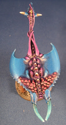
Screamers of Tzeentch WIP
 |
| From Mars' Project Blog |
My Month of Tzeentch thing is quickly shaping up to be a photo finish. I have not yet finished a model, and I have eleven to do. I tabled the five horrors I was working on to get these screamers done for this month's painting challenge at my game club. I will finish the horrors once the painting challenge is met.
I have seen screamers panned by a lot of daemon players, and they might be right. They are often a bust for me. However, for what I am going for, they serve my purposes perfectly. First off they have melta bombs, so they help me open up armor. Secondly, and far more importantly, they are big long swathes of color. The bright stripes on my display board will hopefully draw people in to see what my army is all about.
Because I am looking for these guys to be flashy I used fairly drastic line high lighting on them. I wanted sever contrast to have them "pop" from a distance, so I gave up some of the blending I would have loved to have done these models. With only the blue and purple done, the severity seems to be working. Proof, my wife, whose interest in my miniatures doesn't extend past her general approval of me doing something I like that is fairly benign, noticed them amidst a horde of other painting projects.
 |
| From Mars' Project Blog |
I should be able to get the pinkish scales and bone-colored spines done fairly quickly. I may go for another color on the tusks to visually represent their warp jaws, maybe that blue-green color I have been using for the fire of my horrors?
Thanks for reading,
T
Tuesday, February 1, 2011
Choosing Colors For Your Army
Oh man are we in for a treat! Deke Stella of Soda Pop Miniatures has graced the ol' MPB with some of his painting wisdom. Check it out below:
Why Won’t They Look At Me?
Today’s topic is, choosing colors for your army.
It is probably important to note my frame of mind when picking colors for an army. I have metric bleep tons of “one off” models that I did just for the joy of painting or to try out new techniques but when I’m ready to paint an army it’s for keeps. Painting an army is a decent investment in money and a bleep off huge investment of time. If I’m going to commit to it then I expect it to compete on a few levels:
1) That it can hang out and compete for a top prize at a painting tournament.
2) That when I take it down to a shop people will look at it.
3) That it is better than the last army I painted.
Now I don’t expect people to be all about #1. I enjoy competitive army painting and I know it’s not everybody’s bag. I firmly believe everybody is striving for #2, even if they won’t admit it. It is frustrating as hell to bust your ass painting a new squad just to show up and not have anybody notice it. You have a right to be proud of your work. Actually getting something painted is an accomplishment very few gamers achieve. Revel in it; don’t be ashamed of the size of your painting bleep. #3 is the only way you get better. I’ve hit many painting plateaus over the years and the only way you get through them is inspiration and the determination to improve. This article will hopefully help you out with #2 and #3.
The final thing to note is that this is in regards to your entire army as opposed to a single model. Certainly, some similar principles apply but in general you can get away with a whole lot more in your color selection when just painting a single pretty model for your cabinet versus selecting colors for a whole army. That is an entirely different article though.
Okay, let’s get down to business.
Armies have to work on a couple of levels to be truly effective and eye catching. If people don’t notice it from 5-6 feet away they certainly aren’t going to stop at it to look at your beautiful, intricate and subdued paint job up close. So the first thing you need is some brightness. Now brightness isn’t the only thing necessary. Amid the sea of brightly colored marines you need something to break up the main color and to cause people to stare at your army after they’ve noticed it. This is where contrast comes in. After that you need some accent colors to really ratchet up the visual appeal. Last are the neutral colors for the unimportant bits and bobs that just need to stay in the background and not clutter the army.
Despite the fact that I said brightness is the first thing that gets your army noticed, I always start my color selection by determining the contrasts. I do this mainly because once you have good contrast it is a relatively simple matter to beef up the brightness. If the colors on the models are too similar to one another then the whole effect of the army is going to simply be a blur when people look at it.

Lets take a look at the first test gor I painted for my Briar Knights army. As you can see he’s lacking in contrast. As a single model he does just fine. In fact, I kind of like his slightly less saturated and more sinister look, but as an army….no way. From a few feet away the skin quickly blurs into the fur. It is hard to separate the different elements on the model. He becomes something of a muddled mess.

Now lets look at how I fixed that. The blue tint on the skin got pulled almost entirely out, sticking with the browner tanned flesh. While the brown tints were removed from the fur and stronger blue elements were played up. Now there is nice clear color distinction of the key elements (fur, skin, greenery, cloth) across the entire model.
Okay, everything looks good so now, brightness. Most game stores and gaming halls are poorly lit by painting standards and your paint job needs to account for that. I know some painters who refuse to use nice daylight lamps because they know that’s not how the model will be seen. The increased brightness of their painting station causes their colors to trend darker and then in harsh reality the army appears mute. After my Briar Knights, I’m honestly inclined to agree with them. By most standards the gors seem reasonably bright. The green pops, the skin and fur are easy to see, not bad. Now lets look at a group shot.

Bleep. Our good contrasts were tricking us into thinking they were also bright. The location of the skin and greenery make it hard to see from top down, which is your standard viewing angle. The blue dominates and the skin has almost disappeared. They’re certainly interesting models but easy to miss when you walk by. Now take a look at the warhounds.

Pow! It almost looks like photo trickery they’re so much brighter and easier to see but the picture is from the roughly the same angle and is the same lighting. They’re the exact same colors. I just brightened them all up. Hands down my Warhounds get more looks and more comments than my gor herds. For that matter my DMB (orcs) get more looks than my gor herds, despite the fact that the paint jobs are years apart in skill.
So what have we learned from this? Choose two colors that contrast and that you can get bright. Take these two colors and use them for the bulk of your model. Typically one color will be skin and another will be the clothing, armor, or fur. Between the two you will get the bulk of your model painted.
After I’ve settled on my two primary colors I always search for one or two accent colors. On my Briar Knights it is the wine red cloth and the greenery. On my DMB it is the blue weapons and white banners, dags, and checks. These colors usually occupy only one or two points on a model. Their purpose is to break up the two primary colors and inject a little more visual interest on the model. These colors in general should contrast but it’s most important that they’re bright and pop. If they can’t be seen they don’t really do much for ya. Arguably this is a failing of my Briar Knights’ accent colors when compared to my DMB. When in doubt white or bone are your friends as accent colors.
Last but certainly not least you need to choose your neutral colors. Models these days have all sorts of detail. Much of it will never be seen and is effectively irrelevant unless you’re painting for a competition (and even then it’s largely ignored). Stuff like pouches, belts, trinkets, etc. just need to get out of the way and let the rest the colors do the heavy lifting. Like the failing of the Briar Knights on the accent colors I think it can be argued that a failing of the DMB is that they have too many bold colors. An overly complex palette, while adding character and realism to a single model, just makes an army look cluttered. It’s best to stick with simple neutral browns, greys, or blacks with these.
So far I’ve only discussed the hard mechanics of color selection but not really the visceral, how to chose colors. At Tony’s recommendation we’re going to wrap that up in part two of this article which will be on a blog…..somewhere.
Bleeps were added by me, as per the agreement with FTW Blogroll, sorry Deke. Check out more of Deke's amazing miniatures at the Soda Pop website and this gallery.
Thanks for reading,
T
Why Won’t They Look At Me?
Today’s topic is, choosing colors for your army.
It is probably important to note my frame of mind when picking colors for an army. I have metric bleep tons of “one off” models that I did just for the joy of painting or to try out new techniques but when I’m ready to paint an army it’s for keeps. Painting an army is a decent investment in money and a bleep off huge investment of time. If I’m going to commit to it then I expect it to compete on a few levels:
1) That it can hang out and compete for a top prize at a painting tournament.
2) That when I take it down to a shop people will look at it.
3) That it is better than the last army I painted.
Now I don’t expect people to be all about #1. I enjoy competitive army painting and I know it’s not everybody’s bag. I firmly believe everybody is striving for #2, even if they won’t admit it. It is frustrating as hell to bust your ass painting a new squad just to show up and not have anybody notice it. You have a right to be proud of your work. Actually getting something painted is an accomplishment very few gamers achieve. Revel in it; don’t be ashamed of the size of your painting bleep. #3 is the only way you get better. I’ve hit many painting plateaus over the years and the only way you get through them is inspiration and the determination to improve. This article will hopefully help you out with #2 and #3.
The final thing to note is that this is in regards to your entire army as opposed to a single model. Certainly, some similar principles apply but in general you can get away with a whole lot more in your color selection when just painting a single pretty model for your cabinet versus selecting colors for a whole army. That is an entirely different article though.
Okay, let’s get down to business.
Armies have to work on a couple of levels to be truly effective and eye catching. If people don’t notice it from 5-6 feet away they certainly aren’t going to stop at it to look at your beautiful, intricate and subdued paint job up close. So the first thing you need is some brightness. Now brightness isn’t the only thing necessary. Amid the sea of brightly colored marines you need something to break up the main color and to cause people to stare at your army after they’ve noticed it. This is where contrast comes in. After that you need some accent colors to really ratchet up the visual appeal. Last are the neutral colors for the unimportant bits and bobs that just need to stay in the background and not clutter the army.
Despite the fact that I said brightness is the first thing that gets your army noticed, I always start my color selection by determining the contrasts. I do this mainly because once you have good contrast it is a relatively simple matter to beef up the brightness. If the colors on the models are too similar to one another then the whole effect of the army is going to simply be a blur when people look at it.
Lets take a look at the first test gor I painted for my Briar Knights army. As you can see he’s lacking in contrast. As a single model he does just fine. In fact, I kind of like his slightly less saturated and more sinister look, but as an army….no way. From a few feet away the skin quickly blurs into the fur. It is hard to separate the different elements on the model. He becomes something of a muddled mess.

Now lets look at how I fixed that. The blue tint on the skin got pulled almost entirely out, sticking with the browner tanned flesh. While the brown tints were removed from the fur and stronger blue elements were played up. Now there is nice clear color distinction of the key elements (fur, skin, greenery, cloth) across the entire model.
Okay, everything looks good so now, brightness. Most game stores and gaming halls are poorly lit by painting standards and your paint job needs to account for that. I know some painters who refuse to use nice daylight lamps because they know that’s not how the model will be seen. The increased brightness of their painting station causes their colors to trend darker and then in harsh reality the army appears mute. After my Briar Knights, I’m honestly inclined to agree with them. By most standards the gors seem reasonably bright. The green pops, the skin and fur are easy to see, not bad. Now lets look at a group shot.

Bleep. Our good contrasts were tricking us into thinking they were also bright. The location of the skin and greenery make it hard to see from top down, which is your standard viewing angle. The blue dominates and the skin has almost disappeared. They’re certainly interesting models but easy to miss when you walk by. Now take a look at the warhounds.

Pow! It almost looks like photo trickery they’re so much brighter and easier to see but the picture is from the roughly the same angle and is the same lighting. They’re the exact same colors. I just brightened them all up. Hands down my Warhounds get more looks and more comments than my gor herds. For that matter my DMB (orcs) get more looks than my gor herds, despite the fact that the paint jobs are years apart in skill.
So what have we learned from this? Choose two colors that contrast and that you can get bright. Take these two colors and use them for the bulk of your model. Typically one color will be skin and another will be the clothing, armor, or fur. Between the two you will get the bulk of your model painted.
After I’ve settled on my two primary colors I always search for one or two accent colors. On my Briar Knights it is the wine red cloth and the greenery. On my DMB it is the blue weapons and white banners, dags, and checks. These colors usually occupy only one or two points on a model. Their purpose is to break up the two primary colors and inject a little more visual interest on the model. These colors in general should contrast but it’s most important that they’re bright and pop. If they can’t be seen they don’t really do much for ya. Arguably this is a failing of my Briar Knights’ accent colors when compared to my DMB. When in doubt white or bone are your friends as accent colors.
Last but certainly not least you need to choose your neutral colors. Models these days have all sorts of detail. Much of it will never be seen and is effectively irrelevant unless you’re painting for a competition (and even then it’s largely ignored). Stuff like pouches, belts, trinkets, etc. just need to get out of the way and let the rest the colors do the heavy lifting. Like the failing of the Briar Knights on the accent colors I think it can be argued that a failing of the DMB is that they have too many bold colors. An overly complex palette, while adding character and realism to a single model, just makes an army look cluttered. It’s best to stick with simple neutral browns, greys, or blacks with these.
So far I’ve only discussed the hard mechanics of color selection but not really the visceral, how to chose colors. At Tony’s recommendation we’re going to wrap that up in part two of this article which will be on a blog…..somewhere.
Bleeps were added by me, as per the agreement with FTW Blogroll, sorry Deke. Check out more of Deke's amazing miniatures at the Soda Pop website and this gallery.
Thanks for reading,
T
Subscribe to:
Posts (Atom)